
Letterforms- Serif in the Didot typeface

Punctuation–in Didot typeface is punctuation.

Weights-in Didot typeface is weights are different regular, italic and bold.

History
The Didot typeface is from famous French painting is called Firmin Didot is a designer the typeface also part of the Didot family of the typeface. It is released in 1799 also developed on a 1784-1811 period by the Firmin Didot. He wants to cut letters out of the type in Paris in France. His brother is called Pierre Didot used in the painting from 1760 to 1853. Didot typeface inspired by the John Baskerville’s is a serif typeface in 1750.
Examples of the use the font
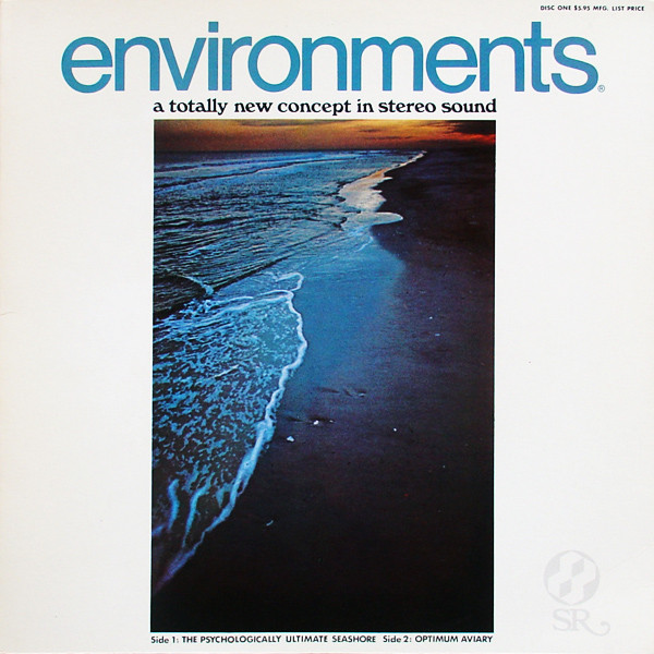
Photo from https://fontsinuse.com/uses/17292/environments-a-totally-new-concept-in-stereo-
The example of the album art of the Environments, a Totally New Concept in the stereo sound of the Didot typeface been used. It is music album art for the music. There many more typeface has been used in the album art.

The example of the packaging of the larelli olive oilsi of the Didot typeface been used. It is packaging for the food. There only the one typeface has been used.
Reference
