Primary Research

I like the COLUMBUS film poster because the background is clear of white background also the trees are over the white background the text in capital letters writing . The other text is around the capital letters around below the text also with the stars of the film.
I dislike the COLUMBUS film poster because is the ladder the middle of the field the trees see the trees in the background.

I like THE WIFE film poster because the text is left of the film poster the text top/bottom/middle of the poster also the two casts on the right of the poster.
I dislike THE WIFE film poster because is the flowers are below the two cast also the background are the stars in the background of the galaxy.

I like the SAMLL FOOT film poster because is the big typeface on the right of the poster also the subheader below the header. The many casts are around the edge of the poster also the casts gave around the bigfoot.
I dislike the SMALL FOOT film poster because is background is blue background also the white of the snow in the ground of the floor.

I like The Eyes of Orson Welles film poster because is the colour in the background range of colour are pink/yellow also the cowboy is a range of colour of the cowboy. The text low middle of the poster of a range of colour.
I dislike The Eyes of Orson Welles film poster because is the text below on the poster also the range of the stars/award/ text across the poster.
Secondary Research
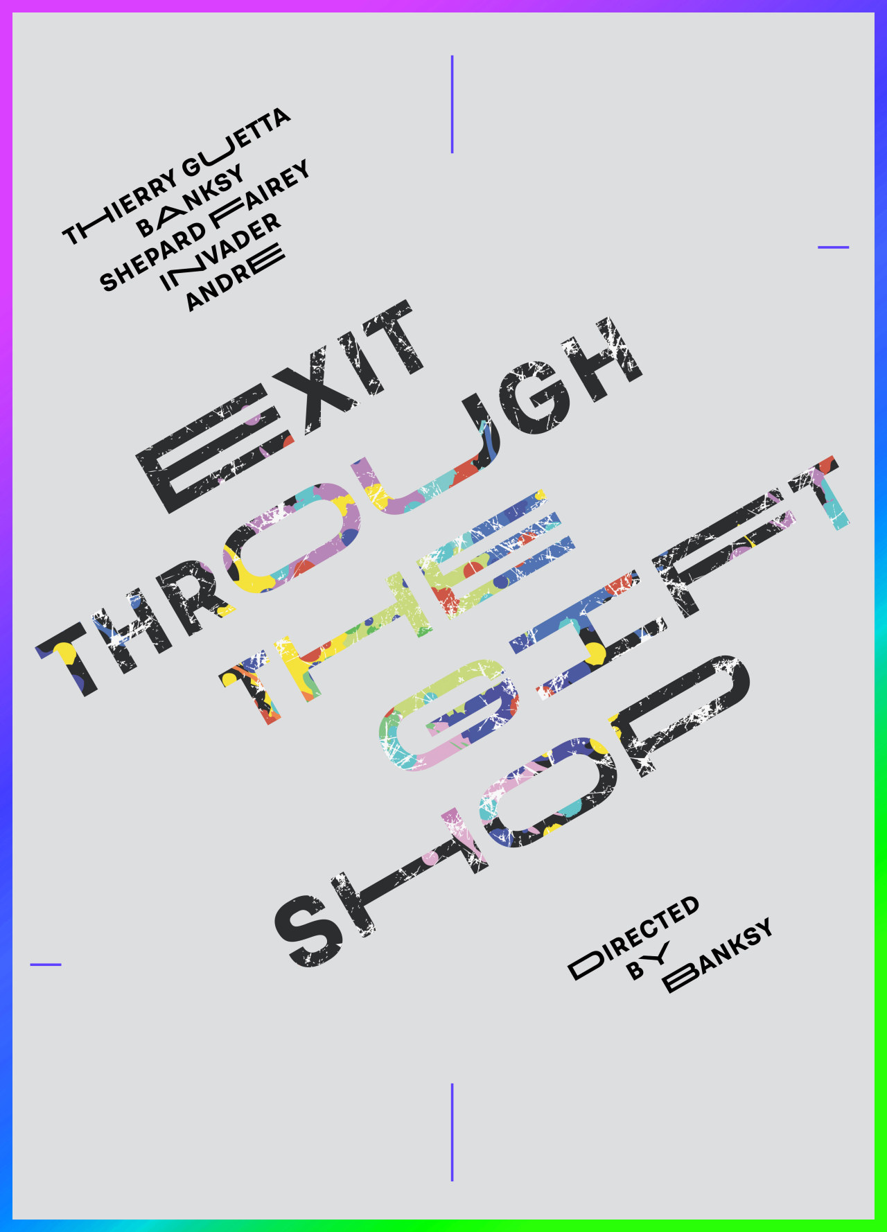
I like the Exit Through The Gift Shop film poster because is the text is across the angle of the poster also the background is range grey/spectrum/black/purple of colours across the border of the poster.They are lines left/bottom/right/top across the page.The typeface is bold with photos inside the typeface.
I dislike the Exit Through The Gift Shop film poster because use range next time design the poster also use range photos in the typeface uses different of colour in the poster.
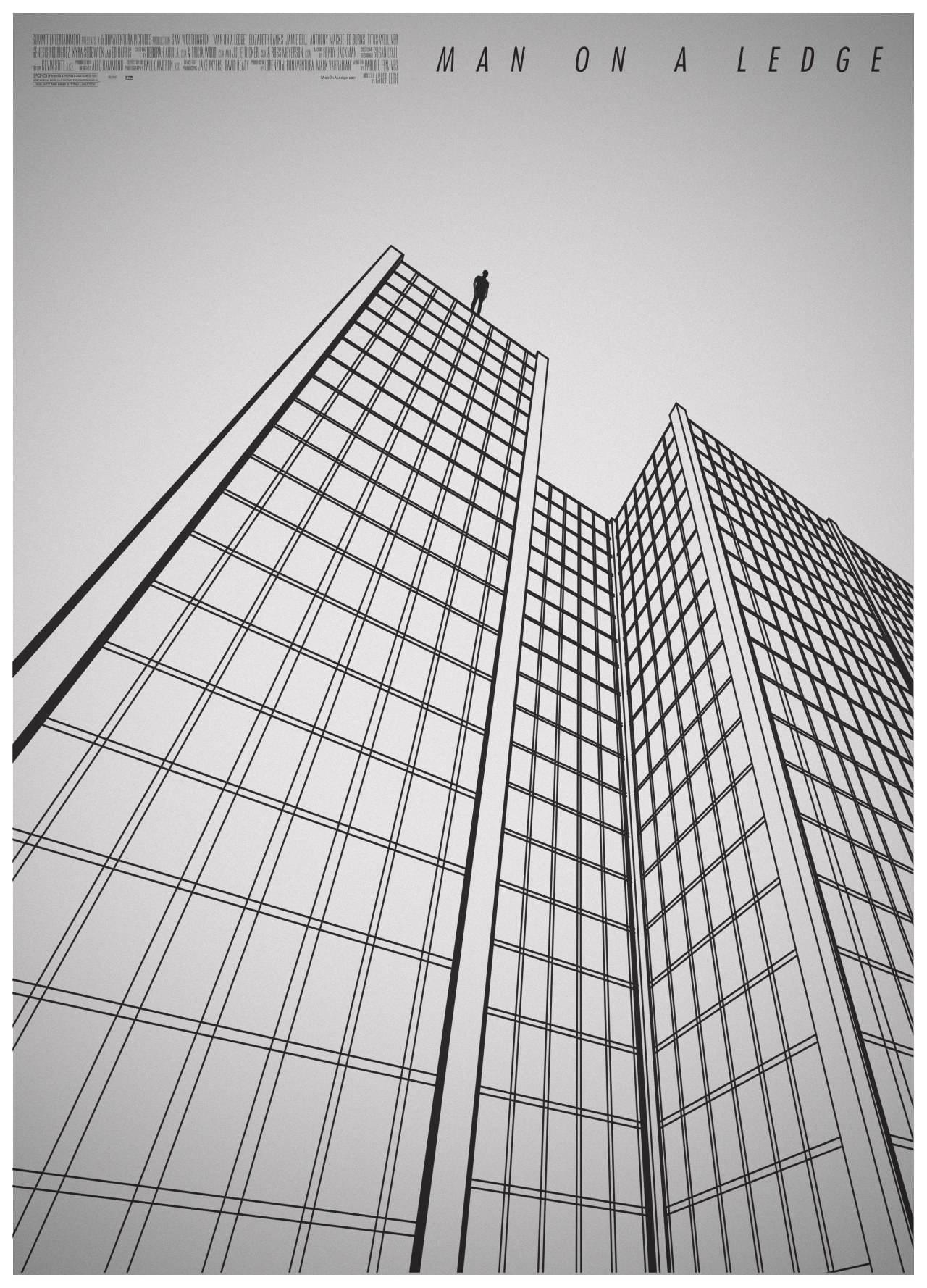
Source photo from http://amovieposteraday.tumblr.com/post/154848766972/day-344-man-on-a-ledge-amovieposteraday
I like the Man on a Ledge because film poster is the lines building a man top of the building also the texts top of the poster. They use black the lines of the building. The colour use black also grey. The shape is used squares in the building.
I dislike the Man on a Ledge film poster because is the small text top of the poster also the text small example the “PGH3” is small paint in the poster. The use of different colour in the poster use of black/white next time use of colours.
Source photo from https://66.media.tumblr.com/ca5a263a244ebbb6ee9b845fa49b57cc/tumblr_oin451Qywn1v3gtoxo1_1280.jpg
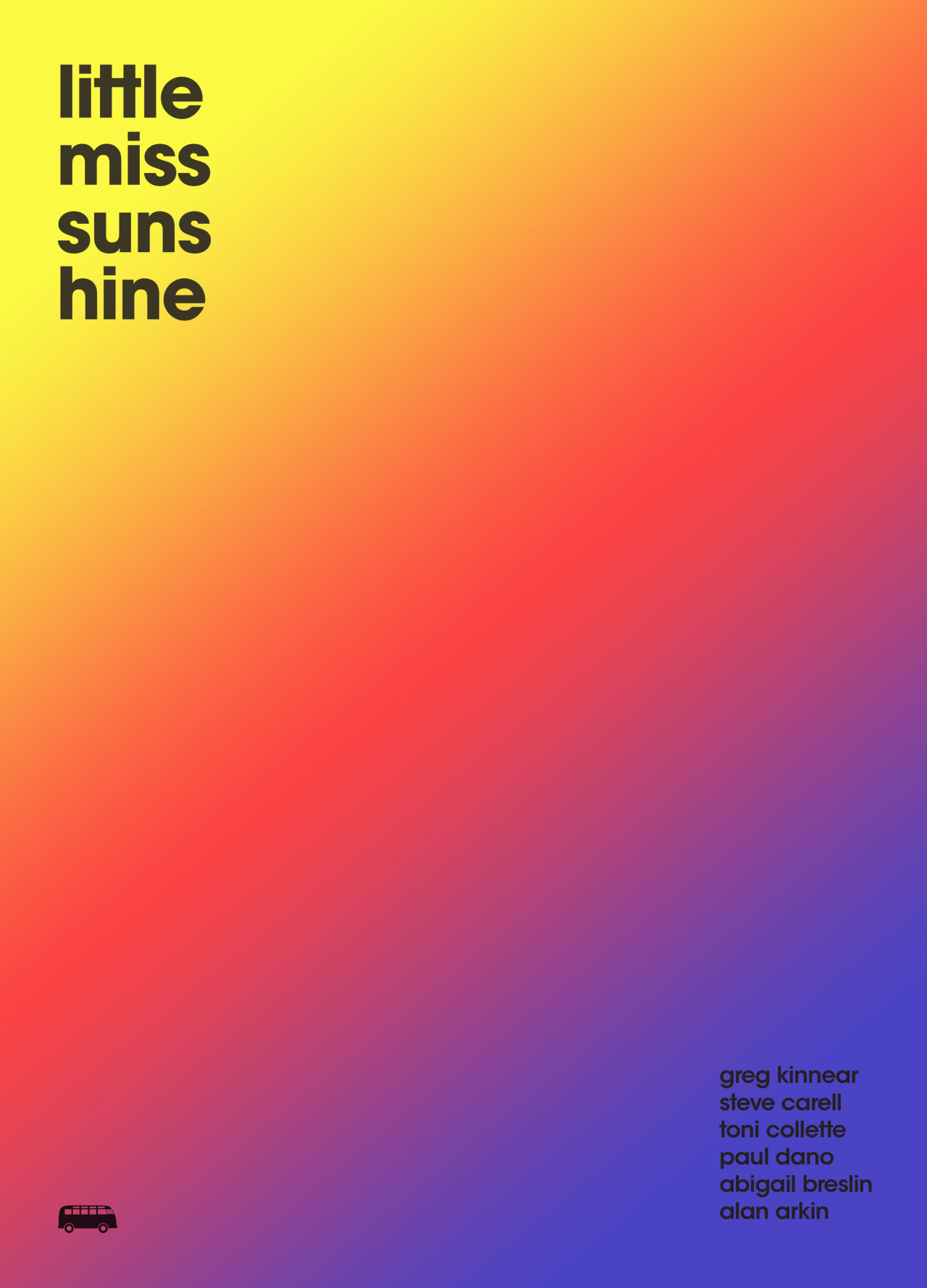
I like the Little Miss Sunshine film poster because is the colour spectrum in the poster the range of colour is yellow/orange/red/pink/purple. The typeface is top left of the poster also the bottom right of the page.
I dislike the Little Miss Sunshine film poster because is are many colours in the background could be many in the background change the colour of the posters.
Mind Map
This is a mind map of ideas of the film are called the darkest hour the film poster design. They include the mind map the film aspect of the film characters, plot, theme, ideas, demographics also the age rating.

Mood board
This is a mood board of ideas of the film the ideas of the poster. They include the mood board are colour palette of colours to use the film poster design. Another include in the mood board are images of the mood of the poster. I used Adobe Color CC to get the colour for the poster.

