This is the potential artists to research- Task 2 and about the influential designers in task 2.
IKEA
I don’t know the design name sorry.
IKEA brochures for kitchens 2019

Here is the link :
- I am looking at the IKEA brochures for kitchens 2019.
- This is the front cover of the IKEA brochures for kitchens 2019 in the front with kitchen image of the front cover.
- I am a looking at the four pages from the front cover, two pages spread and back cover.
- I believe that the designer is thoughts of the IKEA brochures for kitchens 2019 to sell the kitchens at IKEA to design the kitchens at IKEA.
- Another reason is the I believe that designer is feelings of the IKEA brochures for kitchens 2019 to show off the kitchens off at IKEA in the brochures.
- In general, the image tells you this the kitchen of IKEA is on page 6/7 this is telling you a kitchen how much the kitchen cost. It uses a large image on the two-page spread on the page and image is natural lighting.
- Secondly, the elements to be used image, texts, vector, shapes and numbers as well.
- Secondly, another reason is the layout is the large image on the two-page spread with bold text, orange shapes/squares with texts, bold text in the white below text as well text lot of text, vector to be on the right with text and as well price of the kitchen.
- In a nutshell, materials to use the matte paper of the IKEA brochures for kitchens 2019 and techniques they have been used is the large open two spread page with image and the text use it.
- The designer audience for the IKEA brochures for kitchens 2019 for people is getting new kitchens for there homes and can design own kitchens as well.
- As the opinion of the design for IKEA brochures for kitchens 2019, the design is the to the good design for them from the IKEA style Swedish style of the brochures.
- As I see it compare the design other things like the catalogue for IKEA to sell stuff and people can buy items from IKEA shop.
- At one point relevant is the design to you it is a good design for IKEA brochures for kitchens 2019 the layout I like it about and plan the findings of the brochures for kitchens it is good of the IKEA kitchens 2019.
- Although the style has been used the IKEA brochures for kitchens 2019 is the text top of the cover of the brochure, the text is in the under of the main text and is a logo bottom right.
- If principle has been used the only in the kitchens of the shapes of the cover and clear natural lighting image
- Secondly, elements/ composition has been used is the colours in the kitchen cabinet, there is texture in the cover or no pattern in the cover, the shape been used squares shape, the colour been used black cabinet, and there are tone black thing.
- The visual language, been used is the tell you that buy new kitchens of in IKEA in the brochures 2019 and can design your brochures.
- The contextual references, been used modern(contemporary) kitchens at IKEA the contextual references.
Massimo Vignelli
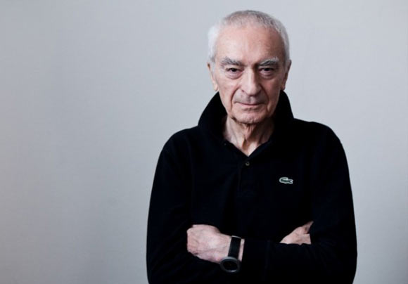
Massimo Vignelli brochure

Here is the link :
https://www.behance.net/gallery/26834021/Massimo-Vignelli-brochure
- A starting point, I look at the Massimo Vignelli brochure of this person.
- This is the front cover of the Massimo Vignelli brochure in the front with the background with black with white text, cool text face. There is the text sidewards facing the normal text and the red block of the box side of the page.
- The left side is the white background nothing there and the middle is the text with red text and with numbers/symbols.
- I am a looking at the total 24 pages in the list and there are 2 per page 12 page.
- I like the profile pictures of him and on the side is the body text with a block of black.
- I believe that the designer is thoughts of the Massimo Vignelli brochure to advertise the brochures of to public designers in general.
- Another reason is the I believe that designer is feelings of the Massimo Vignelli brochure to show off designers to off the work he did.
- In general, the image tells you this the Massimo Vignelli brochure is on page 4/5 this is cool typeface in red text in bold. A huge two body texts in the page and use image under captions and the image under captions in black & white image.
- It uses a large image on the one-page spread on the page and left side image is natural lighting from the windows.
- Secondly, the elements on page 6/7 to be used vectors, shapes, letters with side body text and second page with mage under captions with red text, side body text with block black. Right side bottom image under captions.
- Secondly, another reason page 8/9 is the layout is the left top body text, middle-ish his work there under captions. Next page with a typeface with text under captions, the bottom image of the plane under captions and body block black.
- In a nutshell, page 10/11 the materials to use the matte paper I guess the Massimo Vignelli brochure and techniques they have been used is the different two spread page with image and the text use it. Huge body text and metro of Italy and space spread out metro of Italy.
- The designer audience for the Massimo Vignelli brochure for looking him he did so far in the brochure and the advertise his work.
- As the opinion of the design for Massimo Vignelli brochure, the design is the to the very good design for them from him Italian style of the brochures.
- As I see it compare the design other things like the brochure for him to people can look at it and people can be looking through it.
- At one point relevant is the design to you it is a very good design for him the layout I a lot like it about and plan the findings of the brochures it is good of him.
- If principle has been used the only in page 5 of the shapes table is it and clear natural lighting image from the windows.
- Secondly, elements/ composition has been used is the colours in the brochure, there is bit texture in the brochure or bit pattern in the brochure, the shape been used to shape, the colour been across the brochure, and there are tone black /red thing.
- The visual language, been used is the tell you that look at him work Massimo Vignelli brochures and can design your brochure.
- The contextual references, been used modern(contemporary) cool like it and at him the contextual references been used.
